brand communication
Category
Food Fresh
Singapore
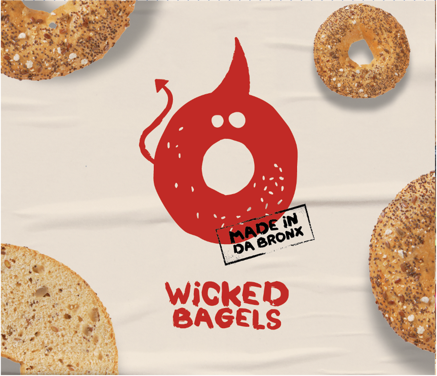
Wicked Bagels brand creation
-
WHY?: The Singapore bagel market was crowded but lacked a player paying a true homage to where bagels are from – New York. Our client wanted to break through with a brand that wasn’t just selling bagels, but attitude — bold, gritty, and unapologetically different. The challenge was to create a concept that captured the raw energy of New York streets and brought it into a B2B food landscape.
HOW?: Meet the Wicked Bagel Family – Made in Da Bronx. We developed a brand rooted in irreverence and character, embodying the grit of New Yorkers through a series of iconic bagel “characters” – from Witty to Wild Bagels. The identity was unapologetic and daring, standing apart from polished competitors. This concept came to life through collaterals, packaging, and a comprehensive brand book, ensuring a consistent and powerful voice across all touchpoints.
EssilorLuxottica
Global
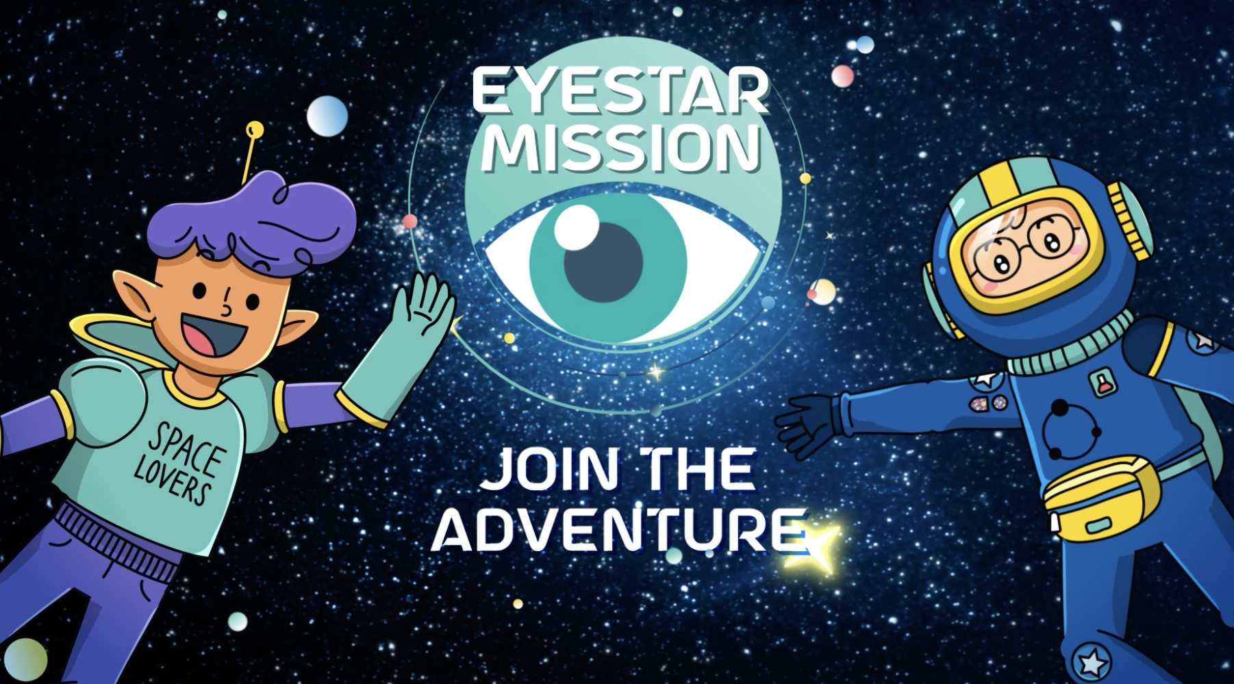
Essilor® Stellest® Myopia Awareness Program (Eyestar Mission)
-
WHY?: Myopia in children is a growing concern worldwide, but awareness and understanding among parents and kids remain limited. The challenge was to create an educational program that would make myopia management accessible, engaging, and memorable — sparking interest in children while equipping parents with the right knowledge.
HOW?: We designed a fully modular awareness program that could adapt to multiple contexts — from schools to optical shops to public events — and to different timeframes, from a full curriculum to a short workshop or an online interactive version. At the heart of the program was a playful, kid-friendly storyline brought to life through videos, gamified activities, and an illustrated activity booklet. To extend impact, we also created communication assets to drive visibility both online and in-practice/in-store, ensuring the program reached families where they are and empowered them to take action on myopia management.
TotalEnergies
Singapore
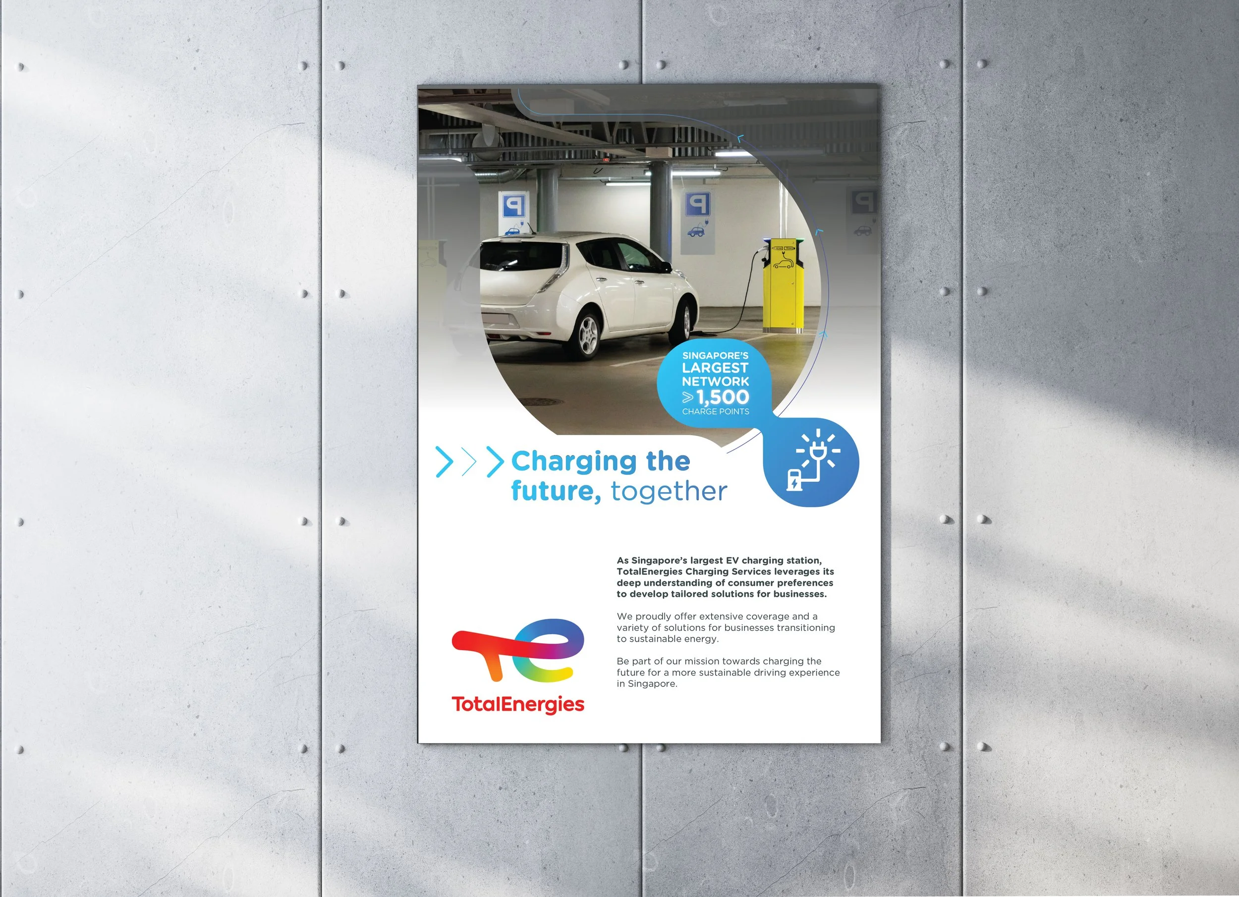
Electric Vehicle (EV) Charging Marketing Plan
-
WHY?: Electric vehicle adoption is accelerating, but drivers and businesses alike need clear reasons to choose one charging network over another. The challenge was to create a visual identity and marketing campaign that convinces B2C users to use TotalEnergies’ stations, while persuading B2B partners/ landlords to install them in their locations.
HOW?: We crafted a distinctive visual identity and a flexible core concept that speaks to both drivers and businesses. The campaign rolled out across ATL and BTL assets, plus monthly social and EDM content, creating a consistent, high-impact presence that drives B2C adoption and B2B partnerships. By unifying messaging across every touchpoint, we positioned TotalEnergies as a trusted leader in EV charging in Singapore.
FNA Group
Singapore
Cocoa Pods brand creation
-
WHY?: A fragmented portfolio needed clarity and consistency. The goal: unify multiple brands under one umbrella while launching a new neighbourhood snacking concept that was fun, memorable, and scalable.
HOW?: Cocoa Pods, by The Cocoa Trees, was born from the wish to built on the beloved mother brand, while offering an accessible and playful network of stores.
We built a clear brand architecture through workshops and research, then created a playful new brand with a witty tone of voice and bold visual identity. The concept was rolled out across store design and communications, bringing the brand to life at every touchpoint.
TotalEnergies
Global
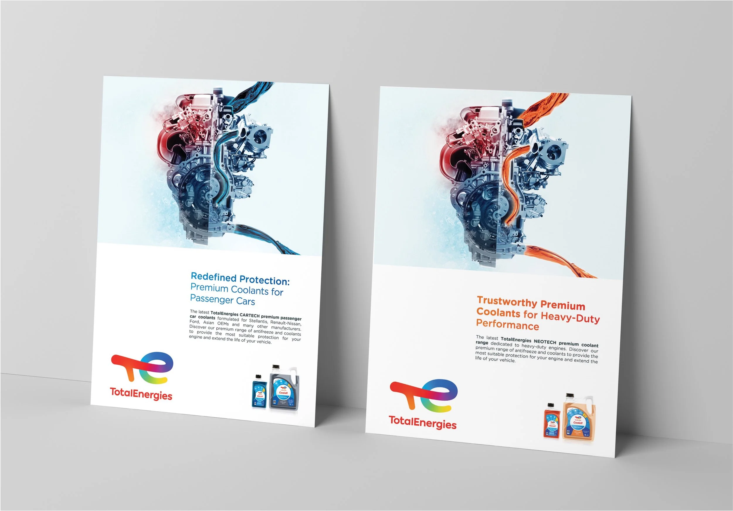
Coolants Marketing Toolkit
-
WHY?: Coolants are often seen as purely technical, but the challenge was to create a marketing toolkit that conveyed both performance and protection in a way that would connect emotionally with customers. The goal: highlight the full range’s features and benefits while elevating its appeal through a more engaging narrative.
HOW?: We developed a striking visual metaphor — the engine as a heart, with coolants flowing through it as life-giving protection. This concept anchored a complete toolkit with consistent assets across the range: key visuals, POSM (stoppers, shelf talkers, kakemonos, hangers), training materials, brochures, and technical data sheets. By blending technical credibility with emotional resonance, we delivered a campaign that made the client’s Coolants range both memorable and persuasive.
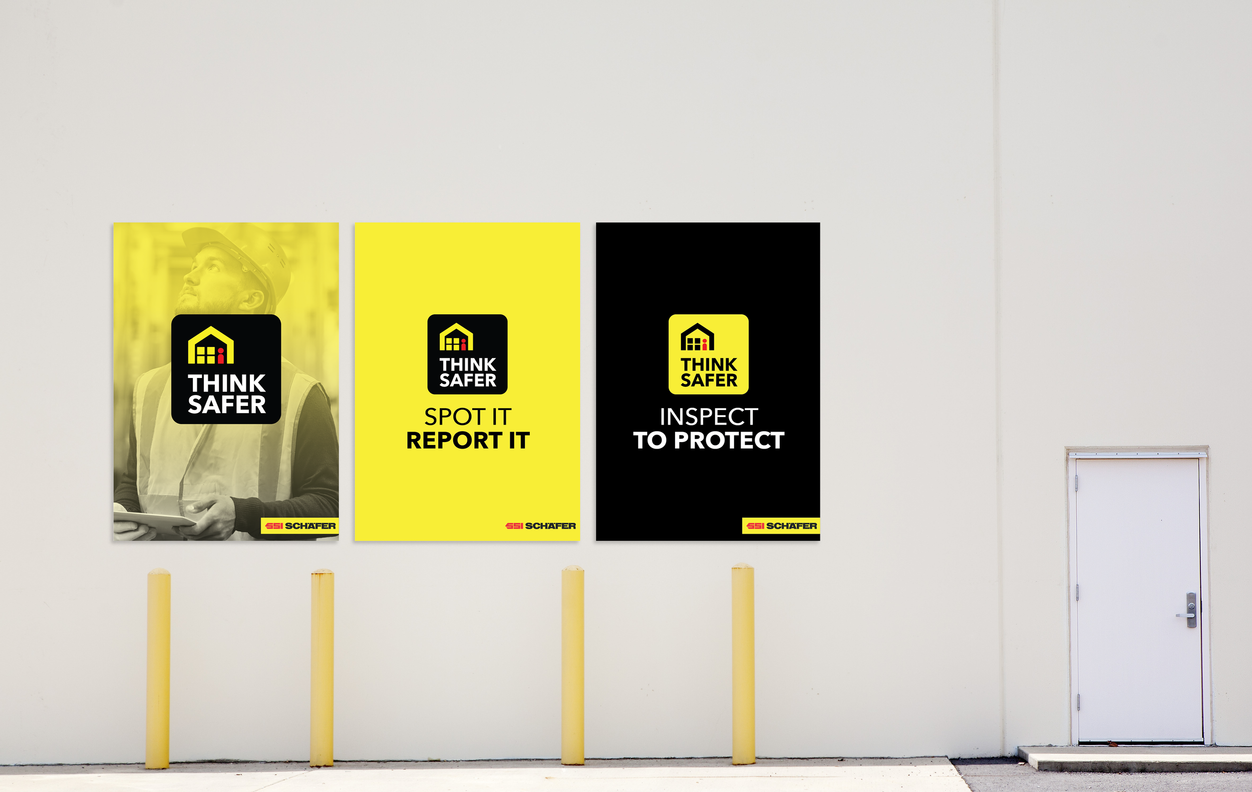
SSI Schaefer
Global
Think Safer Campaign and Trainings
-
WHY?: Safety in warehouses is critical, yet teams often see safety protocols as routine or reactive rather than proactive. The challenge was to shift the mindset from compliance to ownership — encouraging both internal teams and client warehouse staff to embrace safe practices as part of their daily behaviours.
HOW?: We created the concept THINK SAFER WITH SCHAEFER, supported by a distinctive visual identity that made safety both visible and actionable. From there, we developed a full suite of materials — training modules, infographics, and e-books — designed to share knowledge, instill positive behaviours, and keep safety top of mind across warehouses. The campaign not only equipped teams with practical tools but also fostered a culture of accountability and care in warehouse environments.
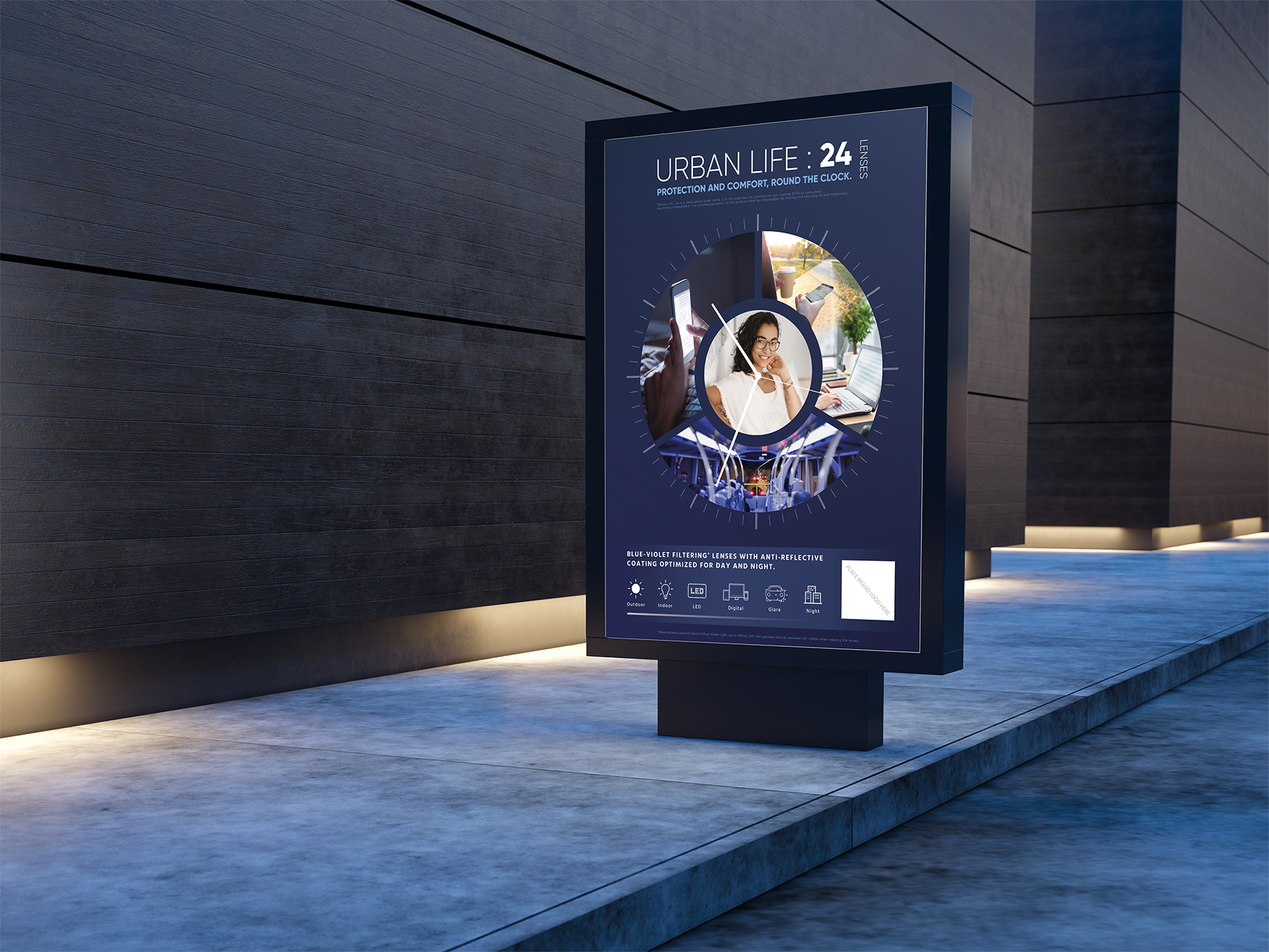
EssilorLuxxotica
Global
Urban Life: 24 Lenses Marketing Campaign
-
WHY?: Young urban dwellers face a 24/7 lifestyle with unique vision needs — screen glare and blue light exposure to day-to-night transitions. The challenge was to create a marketing and communication campaign that clearly conveyed the benefits of advanced optical lenses while being flexible enough for different brands and key accounts to adopt seamlessly.
HOW?: We translated the concept into a distinctive visual narrative: a clock illustrating life’s key moments, showing how the lenses support vision from day to night. This idea extended seamlessly across posters, brochures, training materials, and digital assets, delivering a cohesive, compelling campaign that educates, engages, and resonates with young urban consumers.
VES (Veterinary Emergency & Specialty Hospital)
Singapore
Veterinary Hospital Branding and Space Design
-
WHY?: Pet owners don’t just look for medical expertise — they want care they can trust. Our challenge was to create a veterinary branding and hospital design in Singapore that combined clinical credibility with a human, reassuring touch, while guiding discerning and often anxious owners seamlessly through emergency and everyday visits.
HOW?: We answered with a distinctive yet compassionate identity: a logo fusing the medical cross with a protective hand, extended into a hospital space defined by clarity, calm, and intuitive wayfinding. The result is a veterinary hospital design that feels both professional and personal — a brand now instantly recognized in Singapore’s discerning scene and beyond.